Service
Branding, Creative Direction
Project
CUSP (Scotland)
A digital-last approach to branding a charity that uses the outdoors to provide provide wellbeing support
A digital-last approach to branding a charity that uses the outdoors to provide provide wellbeing support

Jonny Kinross is a family friend that I've know all my life. He's unlike anyone I've ever met. A true bundle of joy and energy with a deeply warm heart. He's the kind of person that would help anyone at any moment.
Jonny Kinross is a family friend that I've know all my life. He's unlike anyone I've ever met. A true bundle of joy and energy with a deeply warm heart. He's the kind of person that would help anyone at any moment.
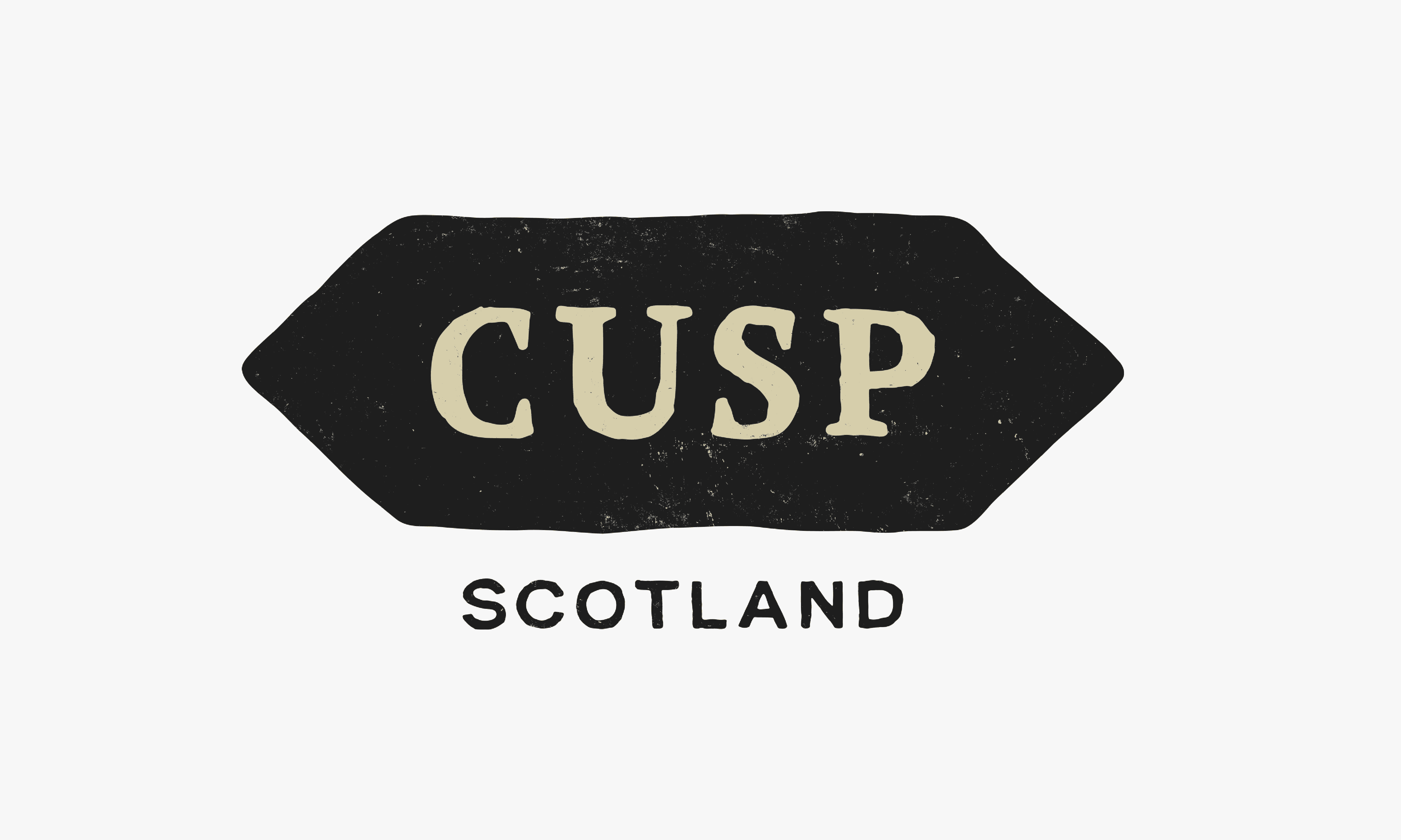
So when he asked me to make a quick logo for his newest venture, CUSP (Scotland), alongside co-founder Alex Scroggie, it was the easiest yes ever — but I said I'd be doing more than just a logo!
So when he asked me to make a quick logo for his newest venture, CUSP (Scotland), alongside co-founder Alex Scroggie, it was the easiest yes ever — but I said I'd be doing more than just a logo!
So when he asked me to make a quick logo for his newest venture, CUSP (Scotland), alongside co-founder Alex Scroggie, it was the easiest yes ever — but I said I'd be doing more than just a logo!
So when he asked me to make a quick logo for his newest venture, CUSP (Scotland), alongside co-founder Alex Scroggie, it was the easiest yes ever — but I said I'd be doing more than just a logo!
About
About
About
About
"CUSP (Scotland) is an emerging social enterprise that uses wilderness experiences, the outdoors, group experiences and one-to-one support to transform how people think and feel about themselves. Its co-founders have combined 50+ years experience of working in communities, recovery, mental health, the NHS, social work, the criminal justice system, youth work and the outdoors."
"CUSP (Scotland) is an emerging social enterprise that uses wilderness experiences, the outdoors, group experiences and one-to-one support to transform how people think and feel about themselves. Its co-founders have combined 50+ years experience of working in communities, recovery, mental health, the NHS, social work, the criminal justice system, youth work and the outdoors."
"CUSP (Scotland) is an emerging social enterprise that uses wilderness experiences, the outdoors, group experiences and one-to-one support to transform how people think and feel about themselves. Its co-founders have combined 50+ years experience of working in communities, recovery, mental health, the NHS, social work, the criminal justice system, youth work and the outdoors."
"CUSP (Scotland) is an emerging social enterprise that uses wilderness experiences, the outdoors, group experiences and one-to-one support to transform how people think and feel about themselves. Its co-founders have combined 50+ years experience of working in communities, recovery, mental health, the NHS, social work, the criminal justice system, youth work and the outdoors."

While CUSP does offer therapy in a variety of formats, I knew that treating it as a wellness brand wasn't quite right. The outdoors are so central to CUSP, and that's their point of difference among the sea of organisations offering mental health care. So it felt more fitting to approach it with the lense of being an outdoor brand.
While CUSP does offer therapy in a variety of formats, I knew that treating it as a wellness brand wasn't quite right. The outdoors are so central to CUSP, and that's their point of difference among the sea of organisations offering mental health care. So it felt more fitting to approach it with the lense of being an outdoor brand.
While CUSP does offer therapy in a variety of formats, I knew that treating it as a wellness brand wasn't quite right. The outdoors are so central to CUSP, and that's their point of difference among the sea of organisations offering mental health care. So it felt more fitting to approach it with the lense of being an outdoor brand.
While CUSP does offer therapy in a variety of formats, I knew that treating it as a wellness brand wasn't quite right. The outdoors are so central to CUSP, and that's their point of difference among the sea of organisations offering mental health care. So it felt more fitting to approach it with the lense of being an outdoor brand.
Parking the visuals for now
To establish more defined parameters, I thought about what is core to the identity. Thinking about how it feels, more so than how it looks. This is what I boiled it down to;
To establish more defined parameters, I thought about what is core to the identity. Thinking about how it feels, more so than how it looks. This is what I boiled it down to;
Soft
Soft
Soft
Approachable
Approachable
Approachable
Low-tech. Not super digital
Low-tech. Not super digital
Low-tech. Not super digital
Human
Human
Human
Not super corporate
Not super corporate
Not super corporate
Digital-last
I then explored a few concepts for the visual side, but because I started digitally first, nothing felt authentic or grounded in anything real. So I decided to get back to basics; pencil and paper.
I then explored a few concepts for the visual side, but because I started digitally first, nothing felt authentic or grounded in anything real. So I decided to get back to basics; pencil and paper.






The concept
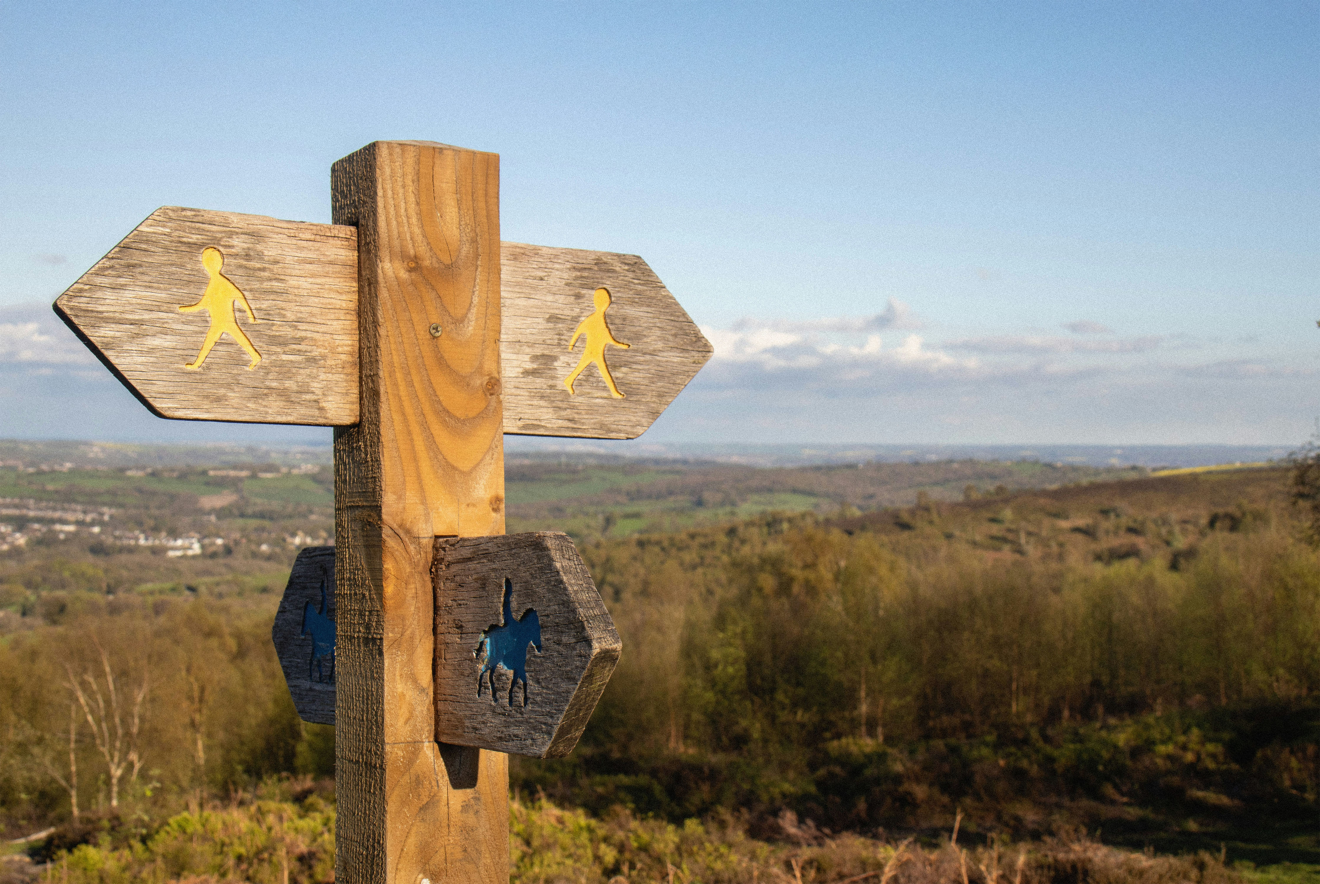
I kept thinking about the wooden signs you see on footpaths. The help at a crossroads, or a reminder you're on a safe path.
Taking to paper, I began drawing some lettering. I opted for a chunky slab serif font as I was thinking about old footpath signs with the carved lettering. The frame around the type references the directional signposts, but keeping them double-ended to represent that there's no one right path. CUSP don't prescribe a blanket approach to all their beneficiaries, they work with each individual to meet them where they are and go from there together.
Once scanned in and a vector version was created, it took everything in me not to tweak a single anchor point! But it needed to have the authentic wobbles of a human touch, and that want to stay true to the human-side overrode the graphic designer in me who wanted to tidy everything up.
The concept
I kept thinking about the wooden signs you see on footpaths. The help at a crossroads, or a reminder you're on a safe path.
Taking to paper, I began drawing some lettering. I opted for a chunky slab serif font as I was thinking about old signs with the carved lettering. The frame around the type references the directional signposts, but keeping them double-ended to represent that there's no one right path. CUSP don't prescribe a blanket approach to all their beneficiaries, they work with each individual to meet them where they are and go from there together.
Once scanned in and a vector version was created, it took everything in me not to tweak a single anchor point! But it needed to have the authentic wobbles of a human touch, and that want to stay true to the human-side overrode the graphic designer in me who wanted to tidy everything up.



A textured logo presented some challenges
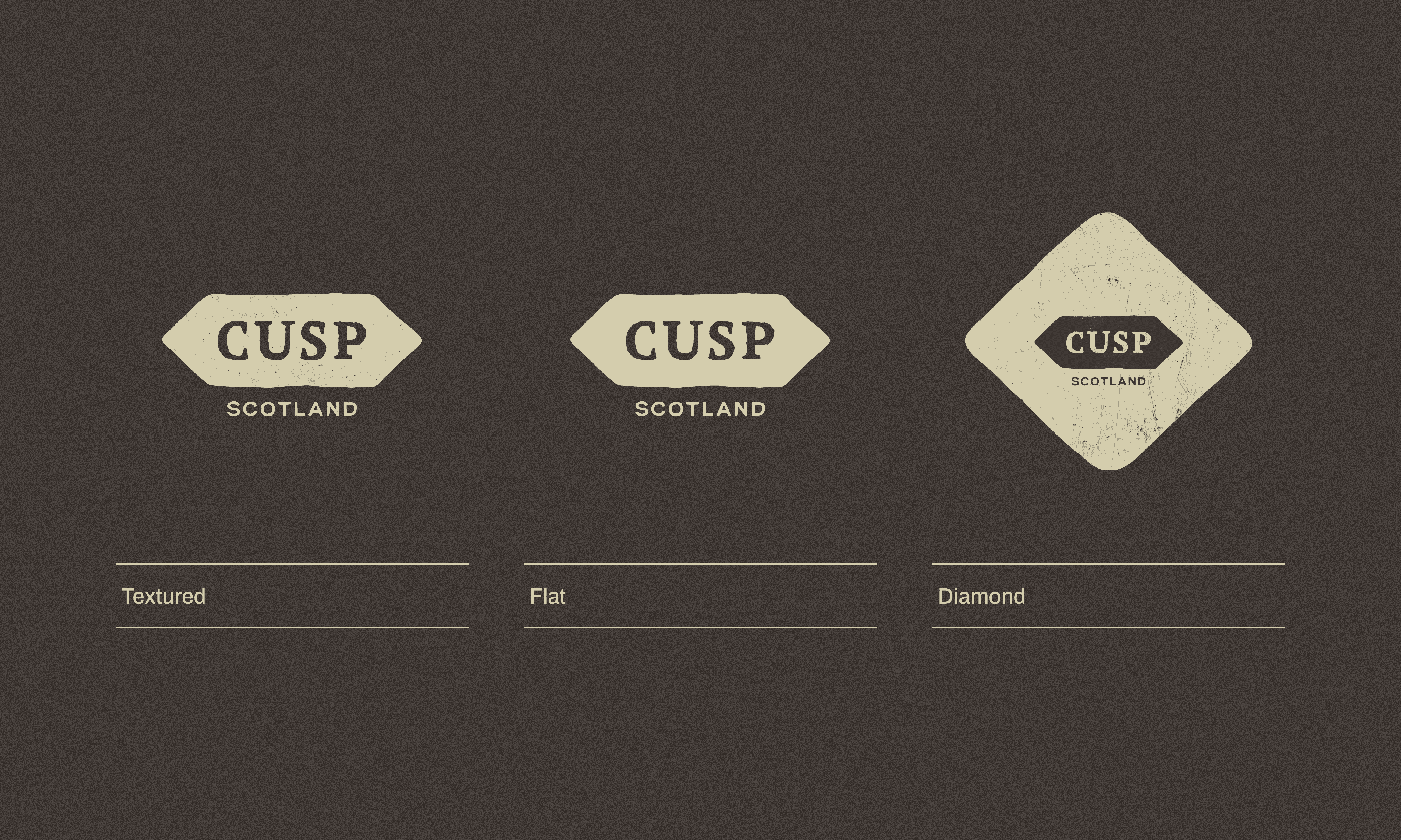
I was really keen to have a textured logo as the primary logo, but with real texture rather than fake vector distress. A flat solid logo just felt too digital. However there's a reason this isn't standard practice! So it was a challenge to figure out how make a textured version I was happy with, and plan for all use-cases when exporting all the logo variations. I opted to have 3 types:
A textured logo presented some challenges
I was really keen to have a textured logo as the primary logo, but with real texture rather than fake vector distress. A flat solid logo just felt too digital. However there's a reason that's not standard practice! So it was a challenge to figure out how make that and plan for all use-cases when exporting all the logo variations.
Textured
Textured
Textured
Textured
The primary logo. Always used on digital outputs, and most print outputs.
The primary logo. Always used on digital outputs, and most print outputs.
The primary logo. Always used on digital outputs, and most print outputs.
The primary logo. Always used on digital outputs, and most print outputs.
Flat
For speciality printing only such as embroidery, foiling, single-colour vinyl etc.
Diamond
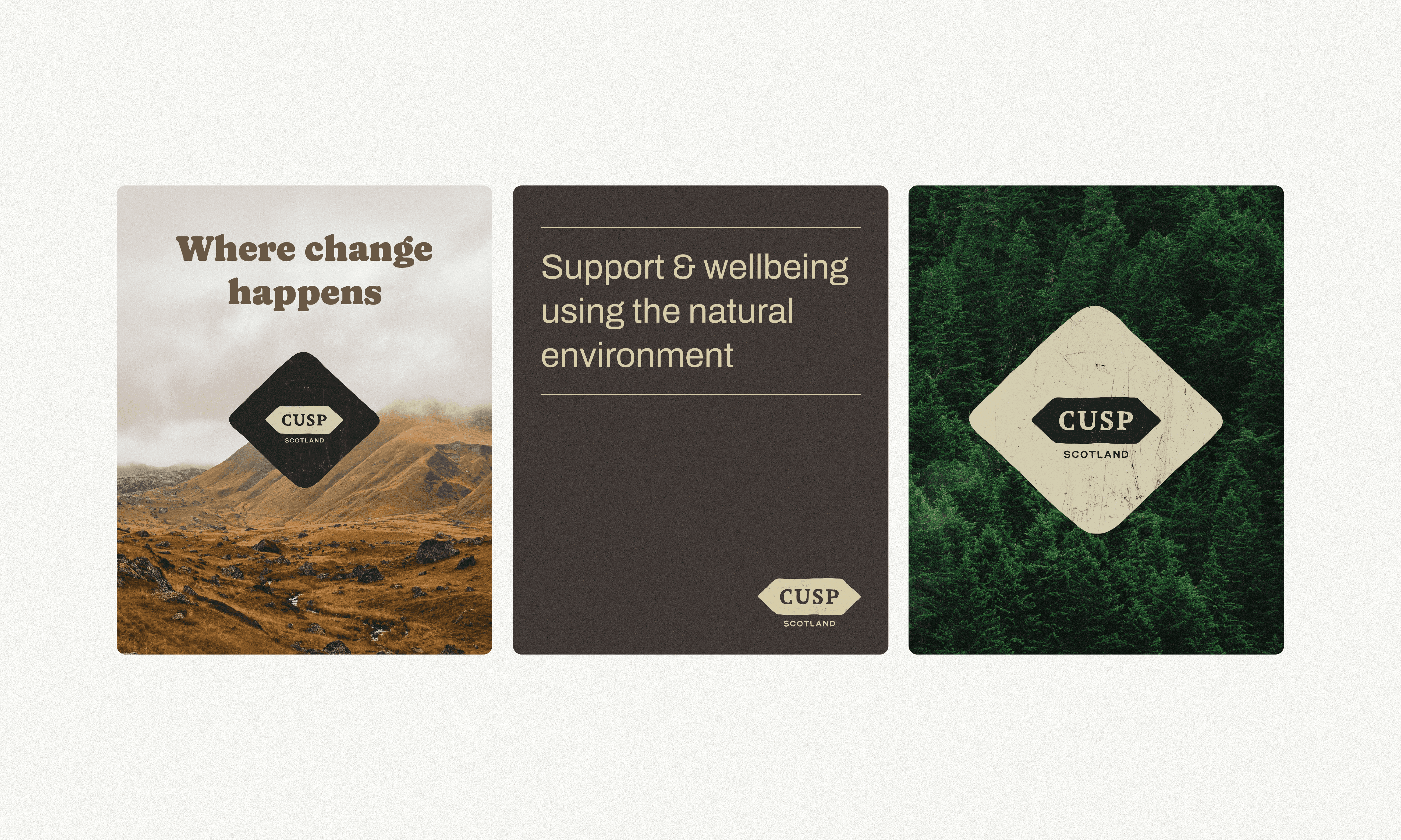
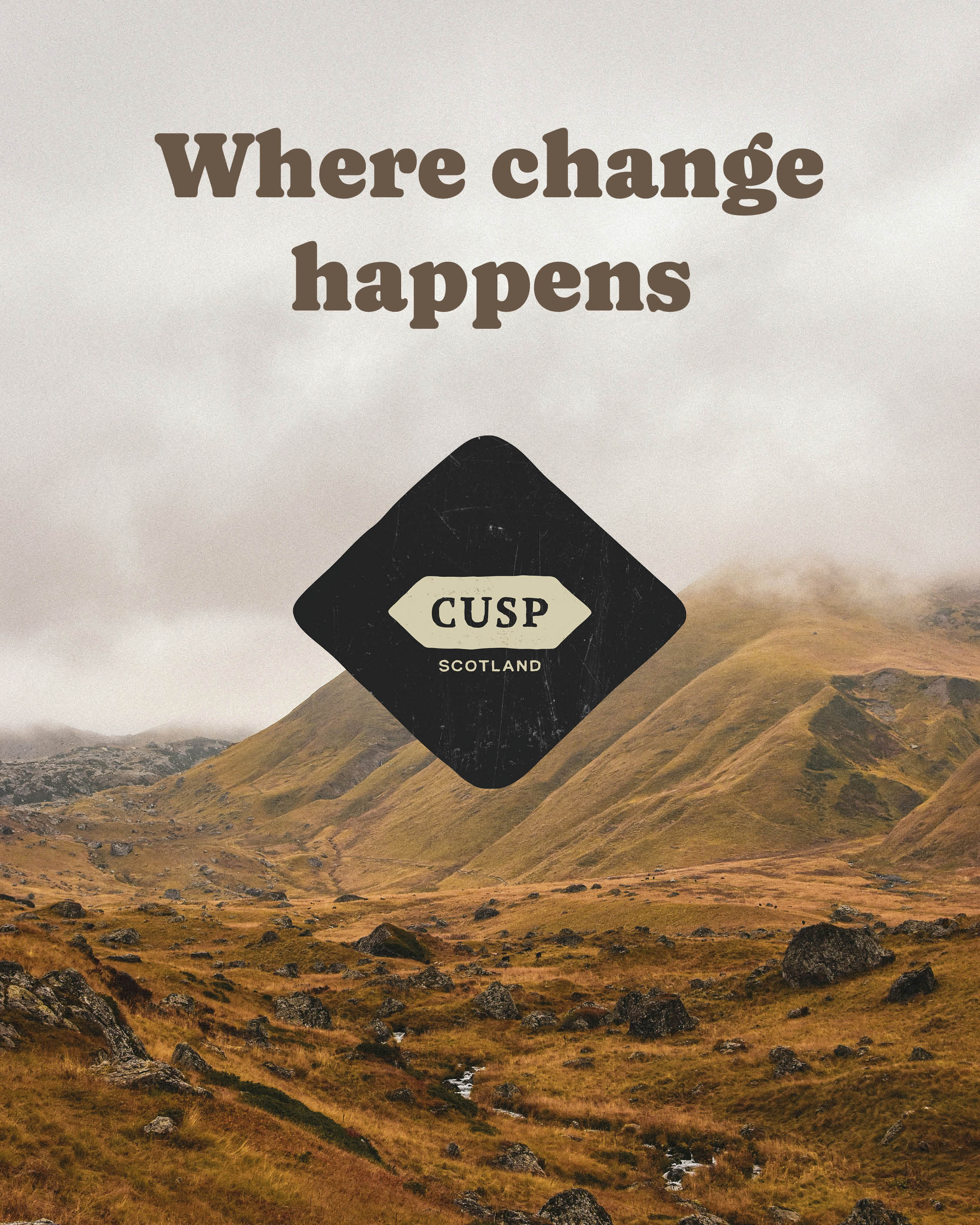
Alternative option for logo housed in a graphic element. Never to be used at small scale. Good for sitting against image backgrounds.
Flat
Flat
Flat
For speciality printing only such as embroidery, foiling, single-colour vinyl etc.
For speciality printing only such as embroidery, foiling, single-colour vinyl etc.
For speciality printing only such as embroidery, foiling, single-colour vinyl etc.
Diamond
Diamond
Diamond
Alternative option for logo housed in a graphic element. Never to be used at small scale. Good for sitting against image backgrounds.
Alternative option for logo housed in a graphic element. Never to be used at small scale. Good for sitting against image backgrounds.
Alternative option for logo housed in a graphic element. Never to be used at small scale. Good for sitting against image backgrounds.

"
"
Ruth managed to immediately understand our vision, what we represent, and how we wish to be understood.
We realised quickly we were in safe hands putting our faith into a designer who understood how precious our approach is to us, and how we are seeking to do something simplistic, pure, organic and free of the digital and modern noise that can get in the way of human interactions and understanding ourselves.
We would heartily endorse and recommend Ruth to any company, charity, agency or project out there looking to give your idea or rebrand the best chance of success and be communicated authentically.
Ruth, we salute your professionalism, care and creativity — thank you!
Ruth managed to immediately understand our vision, what we represent, and how we wish to be understood.
We realised quickly we were in safe hands putting our faith into a designer who understood how precious our approach is to us, and how we are seeking to do something simplistic, pure, organic and free of the digital and modern noise that can get in the way of human interactions and understanding ourselves.
We would heartily endorse and recommend Ruth to any company, charity, agency or project out there looking to give your idea or rebrand the best chance of success and be communicated authentically.
Ruth, we salute your professionalism, care and creativity — thank you!
The magical Jonny Kinross, co-founder of CUSP (Scotland)